

Brand Case Study
Sidekick
Recovery for the purpose-driven athlete.
Take a deeper look at what went into the Sidekick brand.
Since the initial branding in 2016, I’ve also been responsible for the photography, videography, social media, and some product design for this Edmonton startup.
Branding

The Icon
The Sidekick Icon was created to represent the Sidekick brand in the simplest form. Using a combination of simple geometry and modified lettering, the Sidekick Icon stands as a holistic identity.
The inner elements are comprised of a stylized K rotated clockwise at 90º, and a thickness-matched chevron that echoes the symmetry and angles of the K’s arm and leg. The head and foot of the stem on the rotated K are also modified by introducing slight angles that encourage a better flow of the negative space within the encapsulated icon.
The Sidekick Icon itself is structured as an Impact Orange hexagon, a play on the brand’s first product, the Sidekick Curve. Although the product is called the Curve, the icon contrasts this with hard 60º angled corners, but the idea of utilizing the edge remains. The Impact Orange colour was formulated to represent the colour brought by using the Curve.
The Wordmark
The Sidekick logo was created to serve as a visual representation of the environment and experience that makes the Sidekick experience so valuable.
The logo itself is comprised of the custom stylized word Sidekick, streamlined and balanced with the Sidekick Icon.
The SIDEKICK element is set in the DIN Alternate Bold typeface with modified I’s. The I’s were sliced at the top and bottom at 60º to reflect the angles in the Sidekick Icon’s hexagonal structure.
The logo was originally displayed in the three brand colours, Side Blue, Kick Teal, and Impact Orange, showing off the fresh, active, and mobile nature of the new brand, but has since been refreshed to be monochrome and displayed in only Impact Orange.
When shooting the core products, there was an emphasis on showing the products as heroes. The products are typically floating in a dark background and lit with a single flash to create a sense of visual drama.
Product Photography


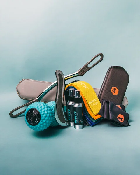
Secondary Photography
For Sidekick’s line of accessories, I decided to use a teal backdrop. In doing so, it establishes a visual indicator of whether the photo is of a core product or accessory. In addition to being categorical, it also addresses the challenge of most of the accessories being in a black or charcoal colourway. This allows the products to stand out and not blend into a dark backdrop.


Detailed Photography
The line of detailed photography was developed as a fresh way to emphasize certain value points of the products. From the refined scraping edge to the grip, I photographed high resolution and close up angles of the products. The products were then edited to look like 3D renders and cut out from the background, allowing me to quickly create any combination of product and background colour, or even quickly create a graphic with multiple products in one, without having to set up the products for a specific photo.


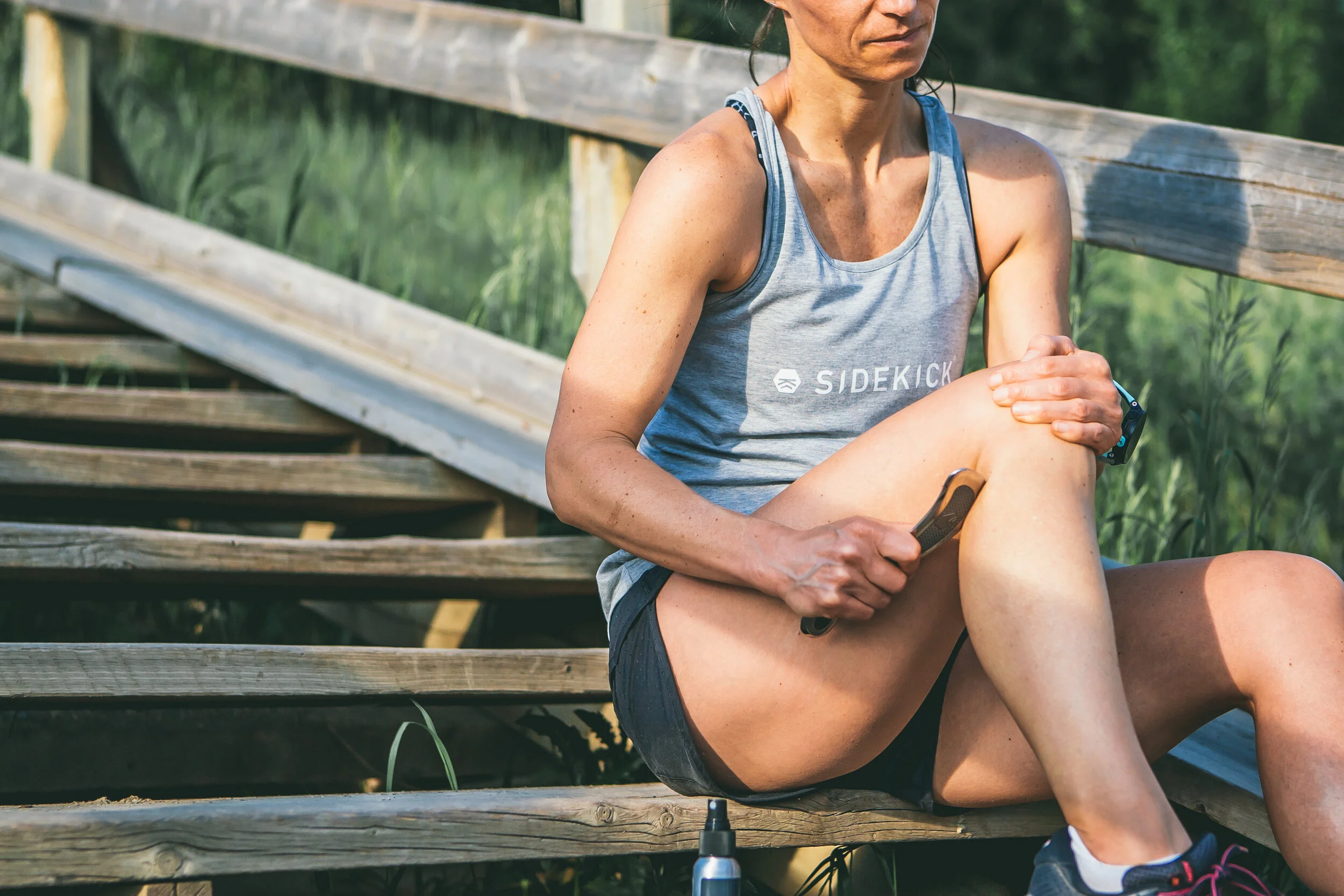
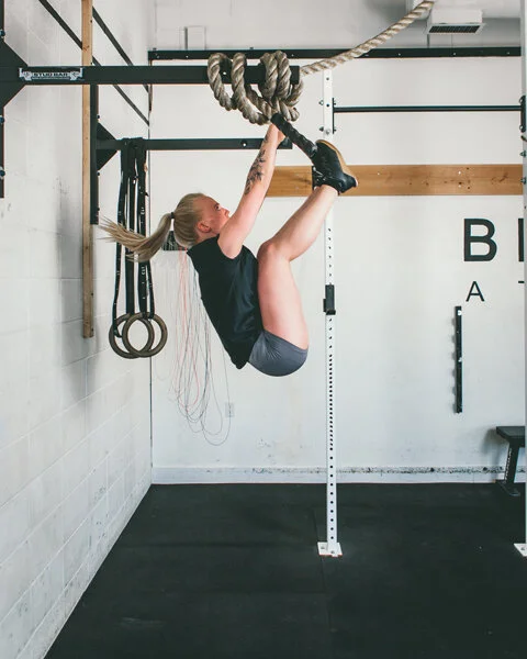
The Sidekick Lifestyle photography was developed to juxtapose the traditional bright colours used in the fitness industry. Muted, desaturated soft tones with an urban-ish aesthetic will strongly connect with tech-savvy athletes and complement the Sidekick colour palette.
The use of bright, natural light is used as much as possible. When working in dark locations, such as gyms, attempts are made to replicate natural lighting. but if not possible, I used this to my advantage by continuing the dark and moody visual drama of the core product photography and using a single light source inside the gym.
Lifestyle Photography


Part of running the Instagram account for Sidekick is creating fresh and on-brand graphics that encourage engagement and present the company as a polished brand. Here are some graphics created for the promotion of product launches, sponsored athlete takeovers, and giveaways that are published alongside regular lifestyle content.
When photographing and creating graphics, we switched to a portrait-only approach as away of capturing as much screen real-estate possible as viewers scroll through their feed.
Social Media


Product Development
Eclipse
Sidekick founder Hin Lai approached me with one simple criterion.
“We need a new product with a hole in it.”
So after some sketching and research, there was a product from a competitor that had a thumbhole in it and four contoured edges.
I developed the Eclipse to have a bit more versatility than the competitor’s product. While they have four countered edges (to the Eclipse’s three), I wanted to focus on the function. The eclipsed hole in the centre allowed for more flexibility in the way the user gripped the tool. Having this new type of grip (compared to Sidekick’s previous scrapers) meant the pressure applied by the user was more in line with the target area, versus an off-set pressure application.


Protector Cases
The need for protective cases came from two aspects. One of the tools is made from a delicate stone and is prone to fractures, and the second is that some of these tools are an investment and people want to bring them to the gym.
When designing the cases, the goal was to create a product that was in line with the brand and provided excellent protection to the products.
In combining both brand and protection, I used an elongated hexagonal shape. This created three points on each side that would not only minimize the point of impact but also absorb it.
While we were developing the protective cases, I was also in the midst of developing a gym bag. With that in mind, I incorporated a MOLLE strapping system to be able to integrate with the future product and strap any cloth or gel accessories until then.

Apex Trigger Point Texture
When introducing the line of Vibration Therapy devices, Sidekick wanted to differentiate their products from existing muscle vibration devices.
In keeping with the brand, I developed a hexagonal point system dubbed the Apex Trigger Point Texture. This continues to be a feature of Sidekick’s flagship Vibration Therapy Devices the Flux and Fuse.
